In 2008 I was asked to rebrand ABRSM, The Associated Board of the Royal Schools of Music. An organisation with a long history, deep royal connections, and an extraordinary influence on how people learn music across the world. It was the first time they’d ever really tackled themselves as a brand.
After many meetings at their offices on Portland Place, I remember sitting in reception and noticing something strange. Silence. Not a single note, not a piano or a violin drifting through the air. For an organisation dedicated to music, it felt oddly quiet.
When we pitched for the project, it felt almost like sitting an exam. We were literally told to turn over our papers. After thirty minutes, time was up. But what we’d already seen, and heard, told us what was missing.
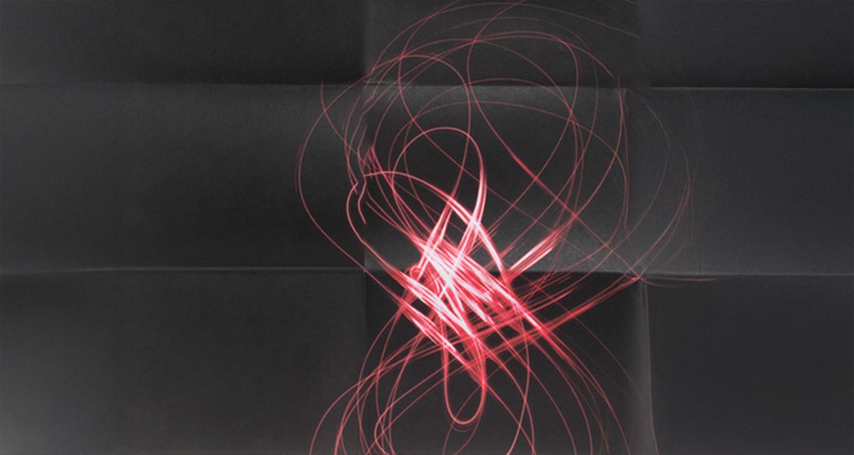
ABRSM was brilliant at examining music. But it had forgotten to express what music does. The emotion. The connection. The power. That became the heart of the new strategy: “The Power of Music.” It captured both the organisation’s authority and its purpose — to make music a force that transforms lives.
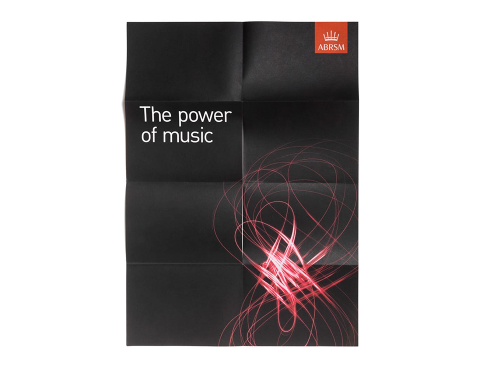
When our agency, 300million, developed the new identity, the organisation was still rooted in print, certificates, syllabuses, sheet music. The design reflected that world: precise, classical, confident.
By 2016, the world had changed. Cog Design evolved the brand for the digital age, refining the logo, updating the tone, and giving the visual system more energy and motion. It was a quiet evolution, not a revolution, and it respected what was already strong.
Then in 2024, Everything Connected refreshed it again. They turned the crown’s musical staves into free-flowing waves, introduced a brighter palette, and rebuilt the website around a more inclusive idea: “A Life With Music.”
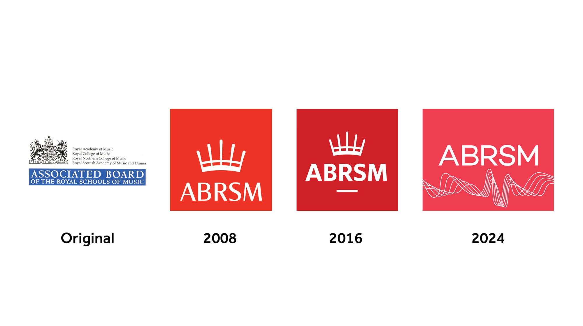
The symbol has changed, but the spirit hasn’t. The Power of Music still runs through every version of the brand.
That’s what a strong core does. It outlasts logos, colour palettes and campaigns. It gives future teams something to build on, not replace.
I like symbols. They can be powerful shorthand for meaning. But in the end, it’s the emotion, not the mark, that makes a brand live.
Read the full ABRSM case study here