

A monthly newsletter wrapping up what's going on in branding, business and bands.
Brand Extra!
What's going on in the world of branding?
This month saw the global roll-out of the brand refresh for Johnson & Johnson one of the world’s most famous and largest healthcare brands. There was plenty of commentary about the move away from the soft script to a more formal font (and legible ampersand!).

- Some people don’t like it.
- Some people don’t like change.
- Some people don’t care.
- Some people won’t even notice.
I wasn’t convinced by the corporate speak on their website; “Each letter is drawn in one pen stroke, creating a contrast that delivers both a sense of unexpectedness and humanity.”
But I am sure in time this will help position the company away from a world of baby oil and cotton buds towards the healthcare innovation company it is focused on becoming.
Read more about the rebrand on Creative Review>>
Read more about the rebrand on Johnson & Johnson’s website>>
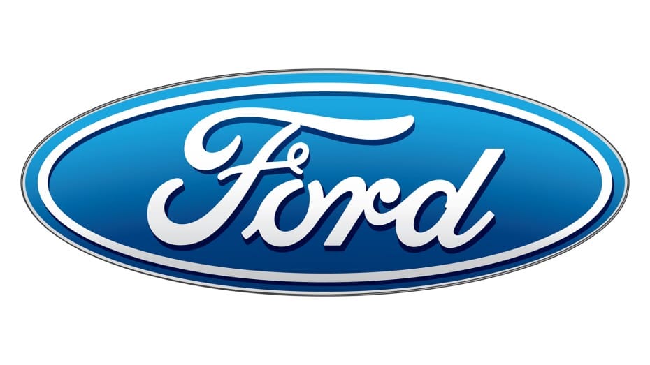
This reminded me of my own brush with a global rebrand; Ford Motor Company which I led the design of whilst working at The Partners in 2003. It’s still an honour (and a slight buzz) to know I played my part in the evolution of a global icon.

- Some people didn’t notice the change.
- Some people didn’t really care.
- Some people didn’t understand how it cost £1m.
But most importantly we solved a huge conundrum for Ford.
In our brief, we were given two distinct directions.
1. Don’t change the Ford Motor Company parent brand.
2. Don’t change the blue oval

I think the hope was we create new elements for everything else (colours, fonts etc) and sort out the brand architecture so that their vast array of car brands (from Aston Martin to the Focus) made sense to customers.

We ignored both directions.
Got rid of the parent brand and created a new global standard.

Result; a new global identity that could be rolled out consistently and easily across all territories (which had never been achieved before) and the symbolism of taking down the long script version of Ford Motor Company from the headquarters in Dearborn and replacing it with the blue oval created a renewed sense of pride amongst the workforce.
Read more about the Ford rebrand and why we kept an error in the artwork here
Read more about the evolution of the Ford logo here>>
Ford rebrand © The Partners 2003
What can you learn?
Insight; make your brand relevant
You can challenge a brief if the answer is going to produce a better solution (but don’t annoy the client!!!).
Story; make your brand unique
Be wary of justifying design changes with post-rationalised nonsense, that takes away from the credibility of what can sometimes just be ‘the correct design choice”.
Engage; make your brand memorable
Making mistakes can create unexpected outcomes. You don’t always have to fix them. If it looks right. Then it’s right.
Business Extra!
What's going on in my business?
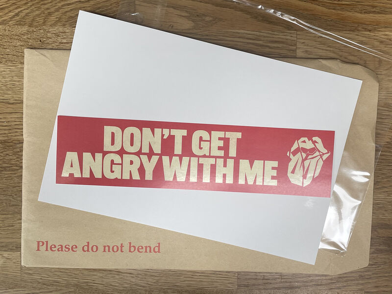
Last month I wrote on LinkedIn about the Rolling Stones sending me a piece of direct mail to promote their new album “Hackney Diamonds”. There were many comments suggesting that direct mail is still an effective way of promoting a business. So, I’ve created my own printed newspaper.
Message me to get a copy

It’s shameless self-promotion, but it's printed, so you can fold it up and read it at your leisure.
Read the original LinkedIn article here
Band Extra!
What's going on my turntable?
A playlist for this month, listen on Spotify Can't forget the motor city
From the birth of Rock’n’Roll (Bill Haley), the creation of the Motown sound, the garage rock blues of The White Stripes and the creation of Techno, Detroit is more than just a motor city. While spending time there finishing the Ford logo, I visited the Museum of Techno and discovered The Dirtbombs. Enjoy a selection of Detroit’s finest…
- Martha Reeves & The Vandellas; Dancing In The Street
- Bill Haley & His Comets; (We're Gonna) Rock Around The Clock
- The Supremes; Baby Love
- The Spinners; It's A Shame
- The Dirtbombs; Kung Fu
- The White Stripes; Hotel Yorba
- The Stooges; Down on the Street
- Electric Six; Danger! High Voltage
- DeBarge; Rhythm Of The Night
- Rhythim Is Rhythim; Strings Of Life
- Inner City; Good Life
- David Bowie, Mick Jagger; Dancing in the Street
🤘 Keep on listening.
🍩 Keep on branding.
Nigel


