Some ideas don’t need to be invented. They just appear.
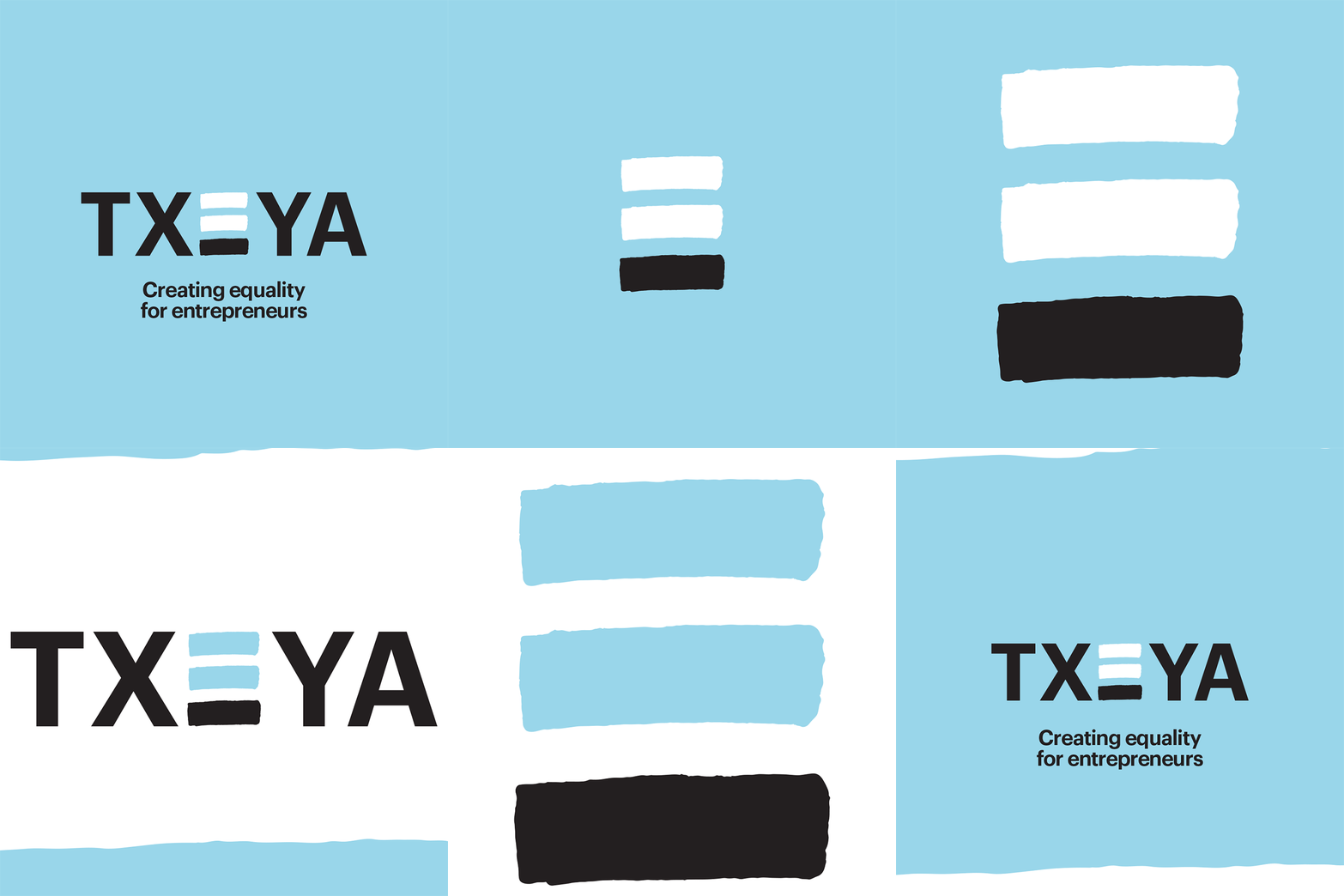
When we began designing Txeya’s identity, the name had already been chosen. We didn’t plan the E to sit at the centre. It simply did. The middle letter — balanced on either side — became a natural symbol for what the brand stands for: equality for entrepreneurs.
That symmetry was a gift. It turned design into meaning. By underlining the E, the mark revealed an equal sign, connecting purpose and platform in one gesture. Fairness made visible.
Txeya is a digital business banking account, funding platform and community for diverse founders; women, Black, minority ethnic and LGBTQIA+. It helps entrepreneurs start and grow their businesses, while connecting investors who want to support inclusive, ESG-driven ventures.
Our task was to bring that vision to life. To create an identity that felt credible to investors and inspiring to entrepreneurs. The balance of both worlds, equality in action, not just aspiration.
Some brands work hard to find their symbol. Txeya already had it. Hidden in plain sight.
Read the full Txeya case study here
