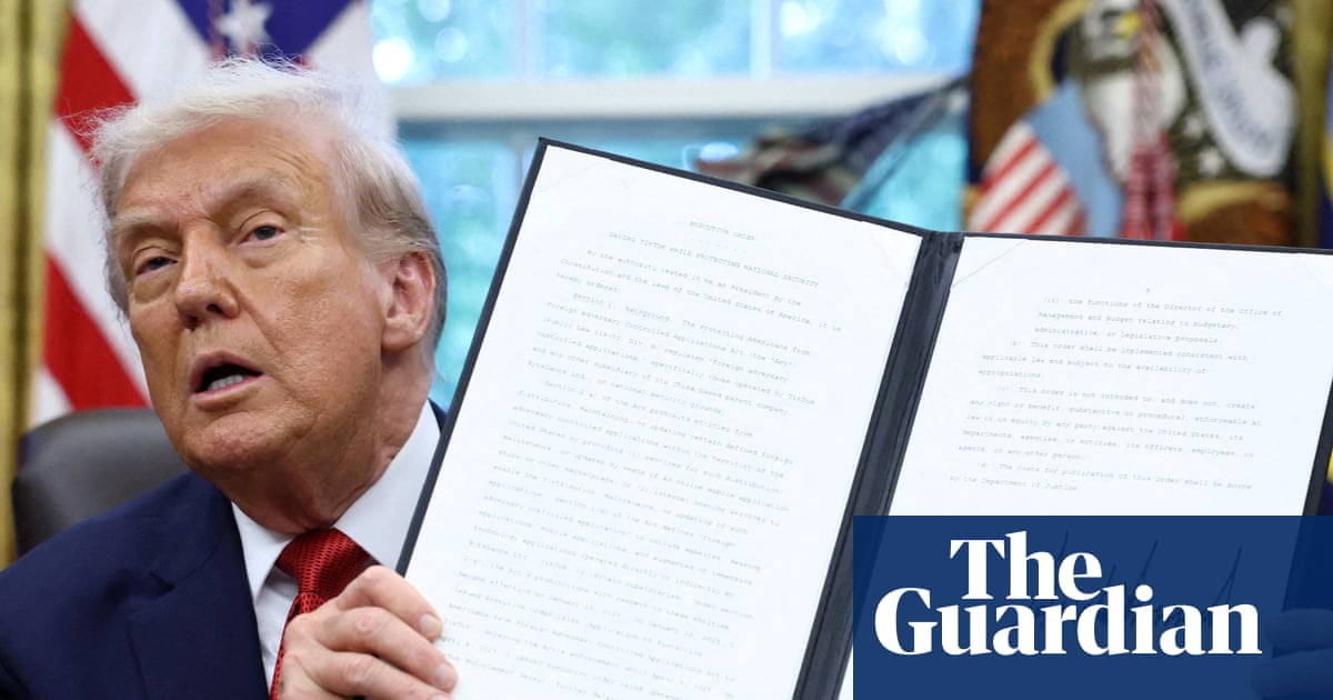
The US State Department announced a change to its document templates.
Out goes Calibri, introduced under the Biden administration.
In comes Times New Roman, favoured by the Trump administration.
Typefaces don’t usually make the culture war. This week, they did.
I’m not convinced by most of the subtext doing the rounds. The idea that Calibri was some sort of “woke” indulgence or a wasteful diversity move doesn’t really stack up. It was introduced for a simple, practical reason. It’s easier to read on screens. And it is.
This isn’t a political point. It’s a brand one.
When leadership changes, one of the first things that often happens is cosmetic meddling. New templates. New decks. New rules. Not because they solve anything meaningful, but because they’re visible. They create the impression of action when there are no better ideas ready to go.
New templates. Wooh.
Refresh mistaken for strategy.
What’s interesting isn’t whether Calibri or Times New Roman is “better”. It’s what people think they say.
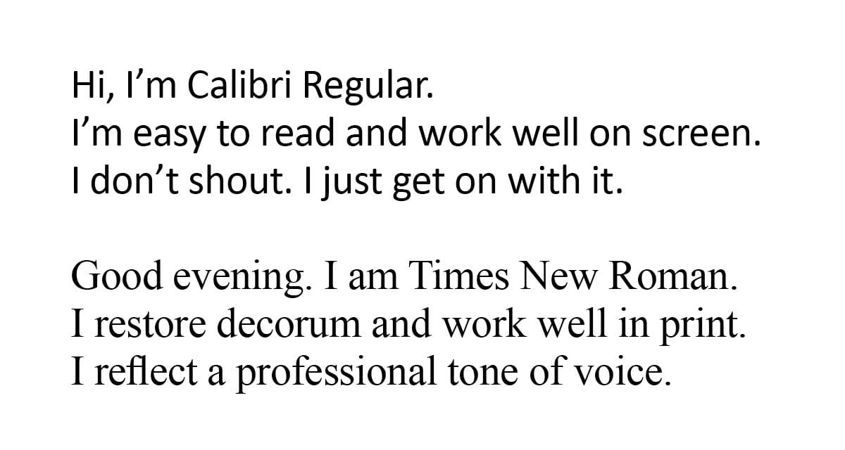
Neither of those voices is neutral. And that’s the point.
Design choices always communicate something, whether you intend them to or not. Fonts, layouts, colours, spacing. They all signal values before a single word is read.
When leaders don’t understand that, or choose to ignore it, brand decisions become gestures rather than strategy.
If you’re going to change how something looks, it should be because you’re clear on what you want it to mean.
Otherwise, you’re just swapping fonts and calling it leadership.
Enjoy your Quick PINT.
For what it’s worth, I’m not a fan of either. I use Effra and Opens Sans for print, and Inter and Noto Sans for digital.
Footnote
A few articles mixed up the terms typeface and font. A typeface is the overall design of a type family, such as Calibri or Times New Roman. A font is a specific version within that typeface, defined by weight, style, and size, for example Calibri Bold or Times New Roman Italic.
Read more about this in The Guardian